AIchor
Giving ML engineers their hardware and attention back

At a glance
- Role
- Product Designer
- Team
- Project manager, ML engineers, cloud engineers, QA
- Timeline
- 2024
- Scope
- End-to-end, from engineer interviews to shipped high-fidelity UI
- Focus
- MLOpsCloudDeveloper Tools
The betMake cloud orchestration feel as direct as running a job locally, minus the fear of losing it.
The short version
- Problem: ML engineers ran long training jobs on their own laptops, burning hours, overheating hardware and losing work when runs failed overnight.
- Bet: The cloud solves the infrastructure; the design problem is legibility. Hide the cloud’s complexity without hiding the engineer’s control.
- Result: Experimentation moved off local machines onto a platform engineers trust with long, expensive jobs.
The problem worth solving
Running experiments locally cost engineers three things at once:
- Time: a single run could occupy a machine for hours or days.
- Hardware: heavy jobs caused throttling and crashes, with the risk of losing progress mid-run.
- A ceiling: local setups couldn’t scale to larger models and datasets.
The cloud answers the infrastructure side. But cloud tooling is hostile to use: config files, quotas, opaque billing, and dashboards built for the people running the cluster, not the people running the experiment.
Make cloud orchestration feel as direct and low-friction as running a job locally, minus the fear of losing it.
My role
Product designer across research, information architecture, user flows, interaction and visual design, working with a project manager, ML engineers, cloud engineers and QA, from first interviews to the shipped interface.
The strategy
Interviews with ML engineers and data scientists, a competitive teardown of cloud-ML platforms, and feasibility sessions with our cloud engineers produced three insights that became constraints:
- Engineers think in code and experiments, not infrastructure. “Run this, on something fast enough, and get out of my way.”
- The deepest fear was silent failure. A long job dying overnight with no reason. Trust, not features, was the currency.
- Competitors optimised power over legibility. They answered “what can this do?” exhaustively, and “what’s happening right now?” and “what is this costing me?” barely at all.
The throughline for every decision: hide the cloud’s complexity without hiding the engineer’s control.
Key decisions
1. A launch flow built on the engineer’s mental model
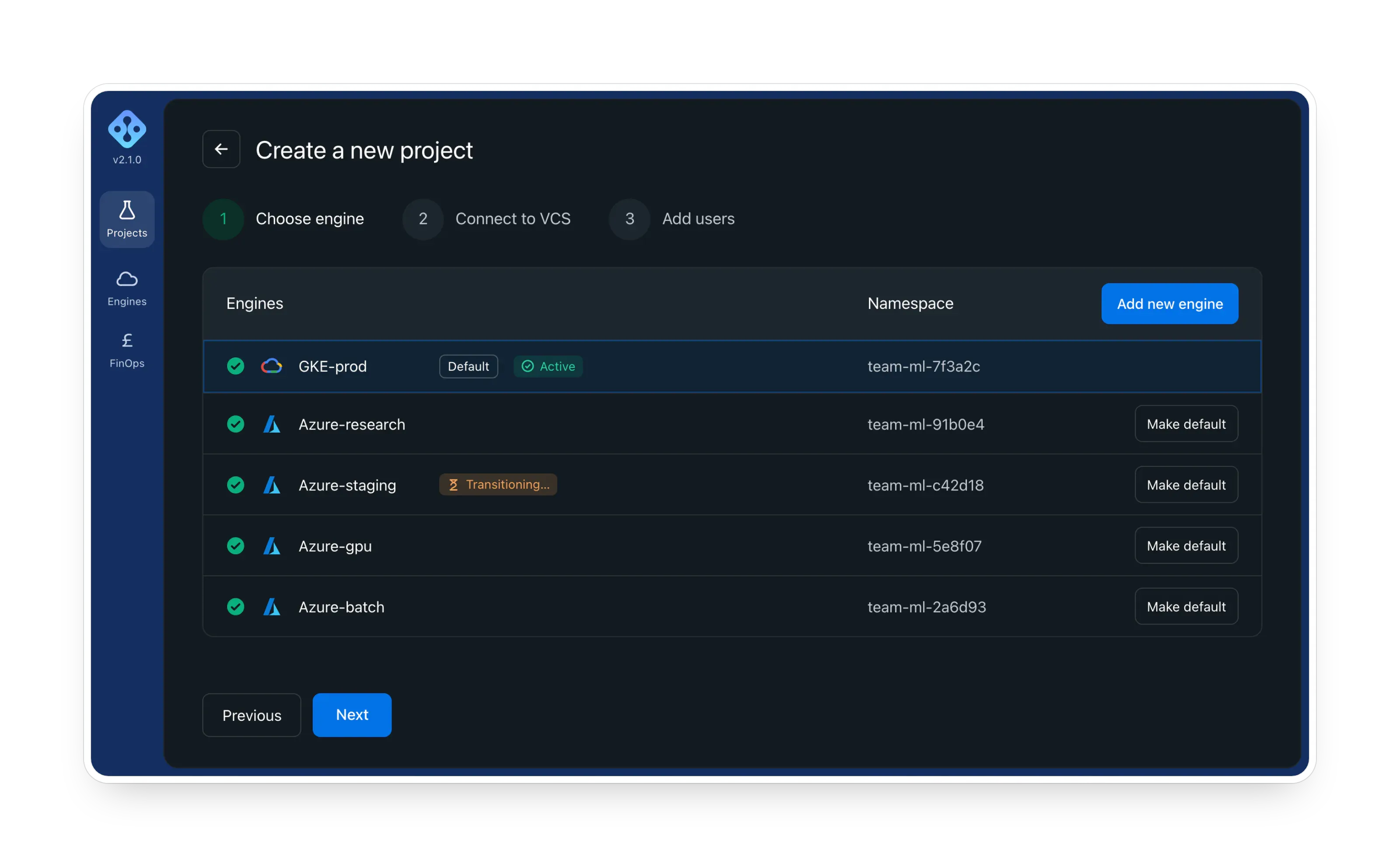
Point at the code, pick a sensible compute option, run. The default path takes someone from intent to a running experiment in as few decisions as possible; advanced configuration stays one layer down.
Why: power should be opt-in, not a tax on every user. (Insight 1)
2. Monitoring that answers “is it alive, and is it okay?”
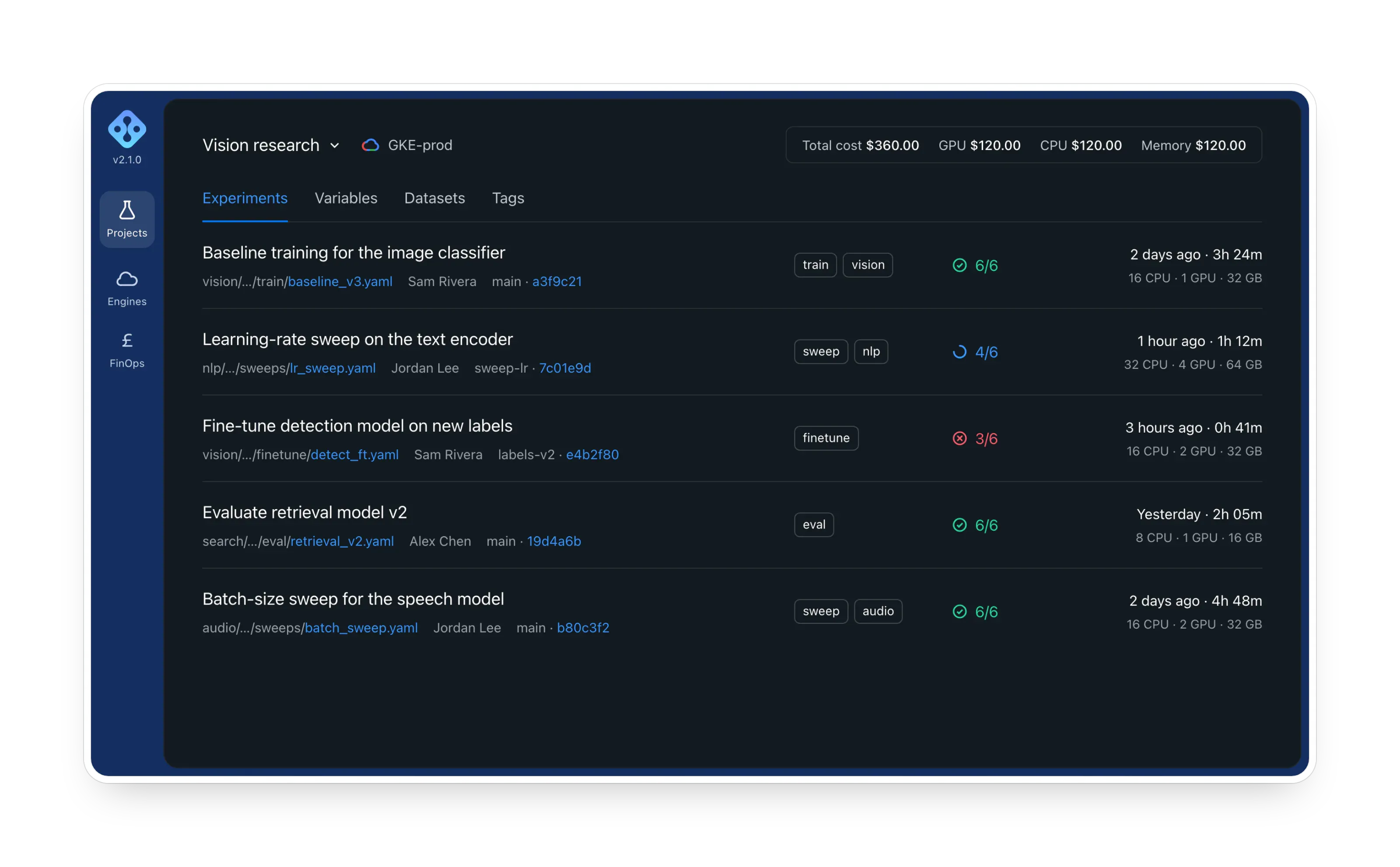
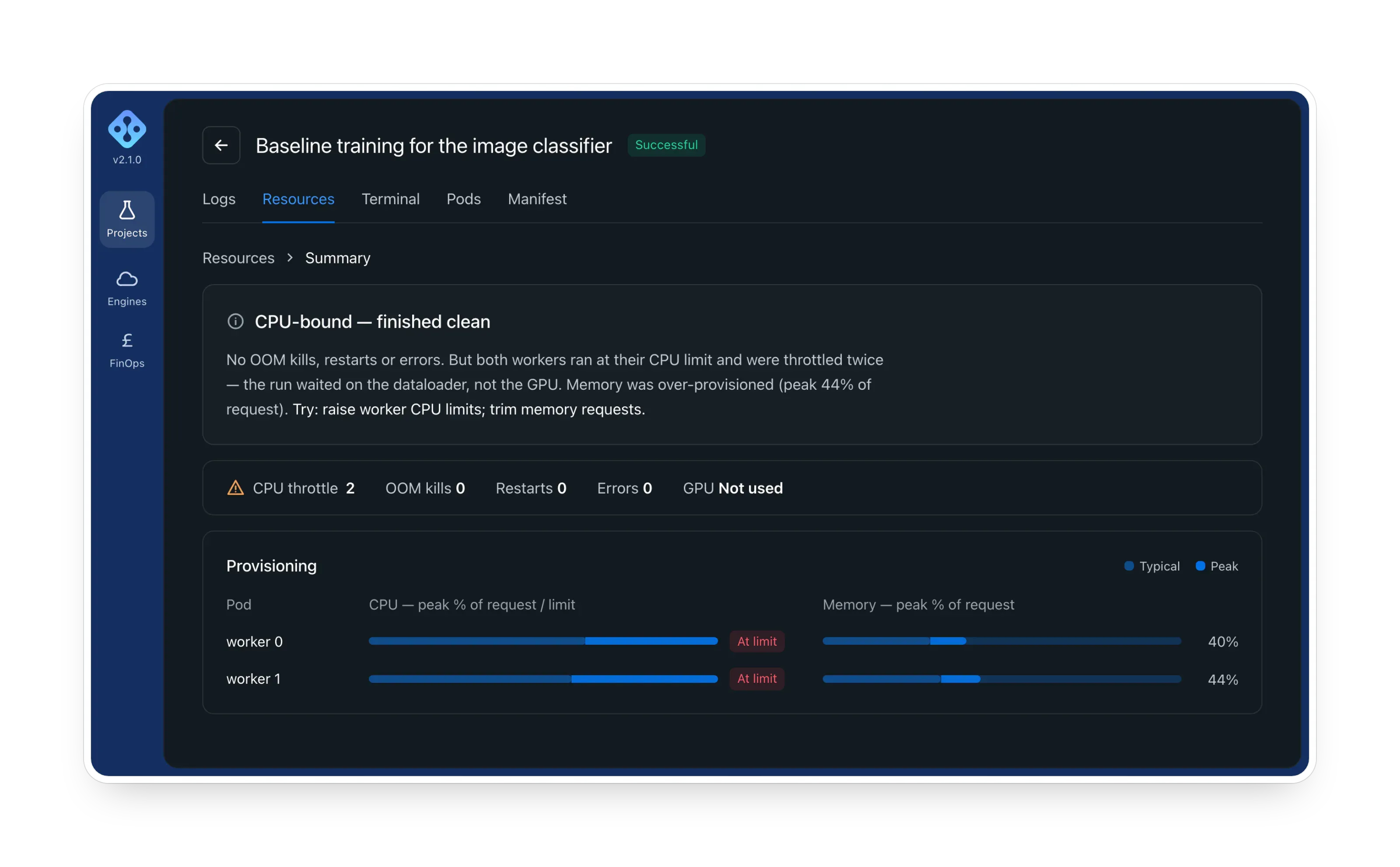
Unambiguous running / failed / complete states, a surfaced reason when something breaks, and logs that are scannable rather than a wall of text.
Why: engineers should glance and trust, instead of refresh and worry. (Insight 2)
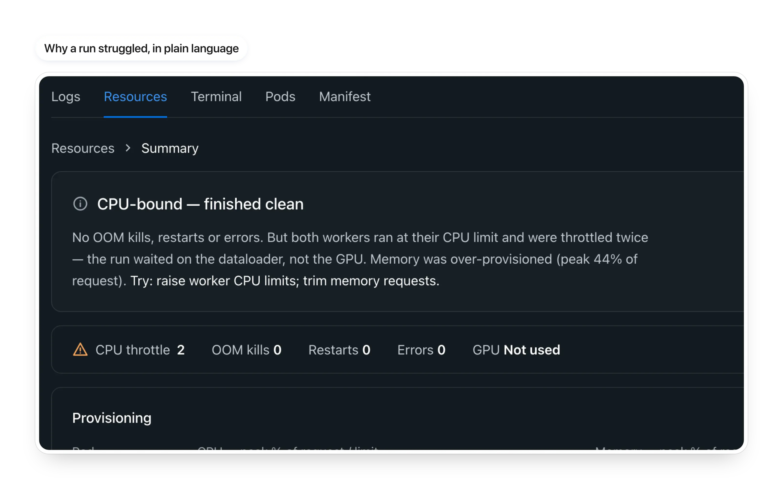
3. Cost visible while you decide, not after
The resources and cost surfaces show how the compute you choose relates to what it costs before you commit, turning an anxiety-inducing bill into an informed trade-off.
Why: competitors left “what is this costing me?” unanswered. (Insight 3)
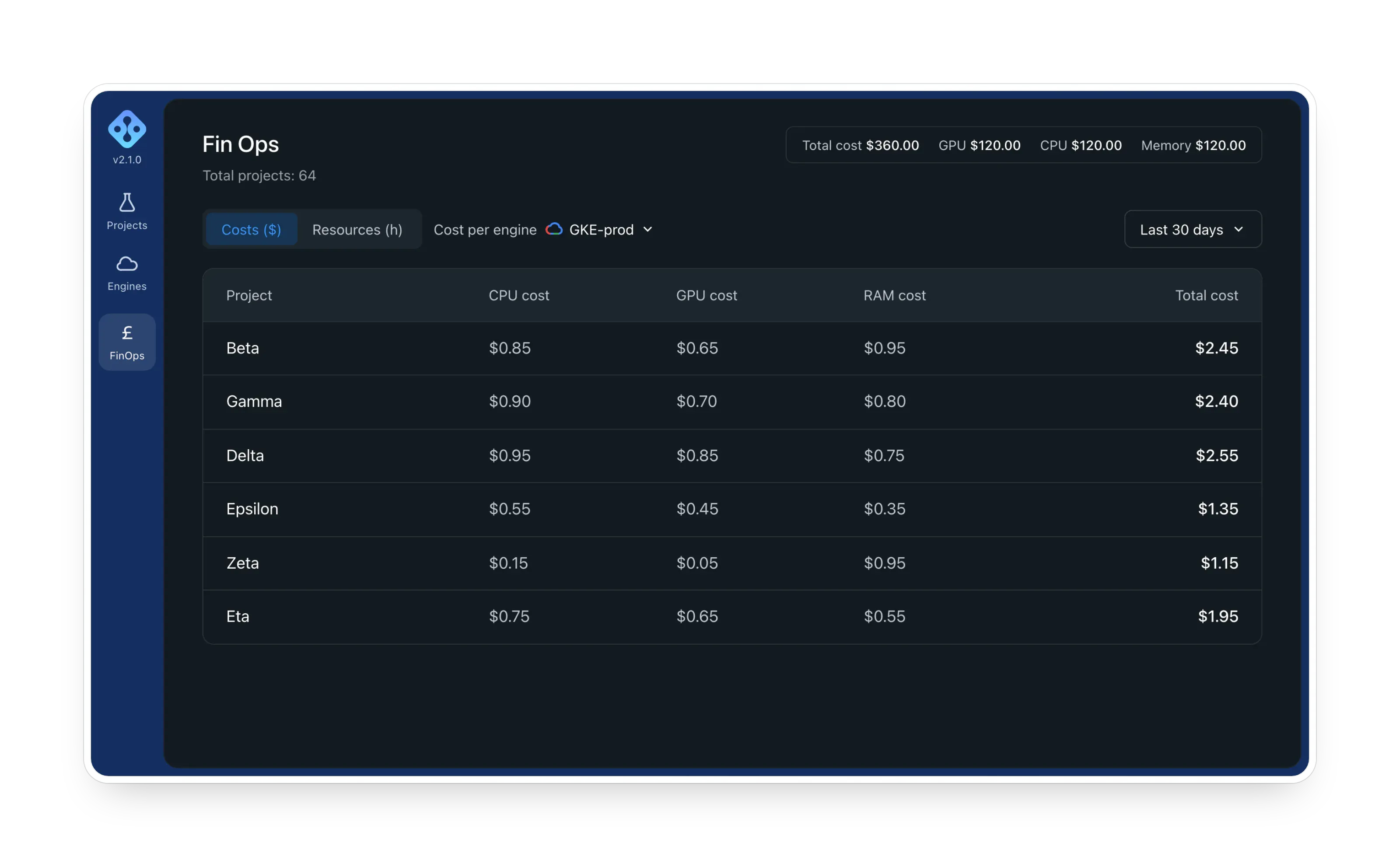
4. One coherent system across a deep product
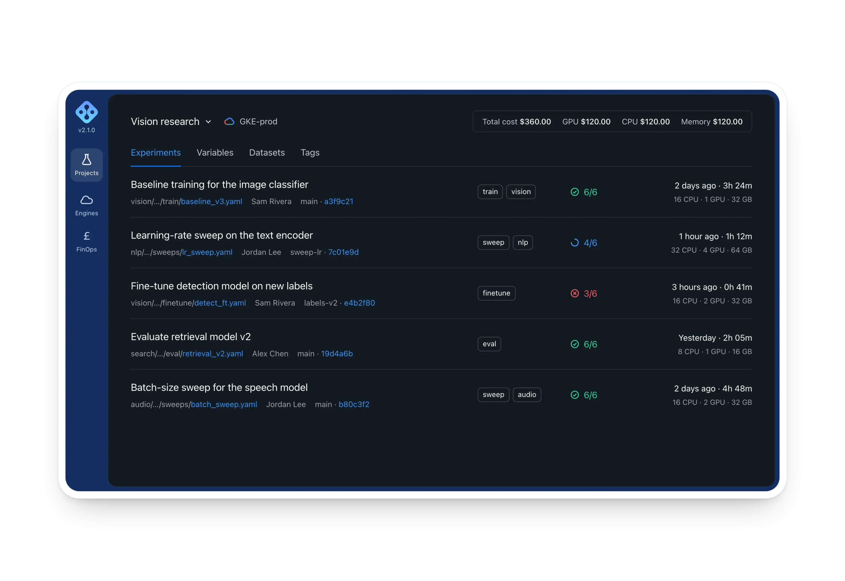
Experiments, logs, version control, resources, storage and administration (a dozen data-heavy surfaces) share one information architecture and interface language, so learning one screen means understanding the next.
Why: a deep product only feels simple if it behaves predictably everywhere.
The hard trade-off
Power vs. simplicity. Engineers wanted full control, but every exposed option made the common path slower. The answer was sensible defaults on the main path, with advanced configuration one layer down. Testing showed people launched with little hesitation, while experts kept every lever.
Impact
Usability testing with engineers validated the central bets:
- Ease of use: participants went from “I want to run this” to a launched experiment with little hesitation.
- Confidence: clear status and surfaced failure reasons directly addressed the fear of silent failure.
- Flexibility: scaling resources up or down let one platform serve both quick experiments and heavy training runs.
Each round fed back into the flows: tighter defaults, clearer states, and fewer steps that turned out to be friction rather than control.
What I learned
Designing for technical users isn’t about exposing more power. It’s about legibility. The engineers had no shortage of capability. What they lacked was a tool that made the cloud understandable and its failures visible. The wins came from removing fear and friction, not from adding features.
More screens