Prism
One design system for four product teams

At a glance
- Role
- Design System Lead
- Team
- 4 UI designers, 4 front-end engineers, COO, design and engineering managers
- Timeline
- Since 2022
- Scope
- Planning, system design, engineering alignment, testing and ongoing governance
- Focus
- EnterpriseDesign SystemGovernance
The betTreat the Deep Design System as shared infrastructure for designers and engineers, not a component library.
The short version
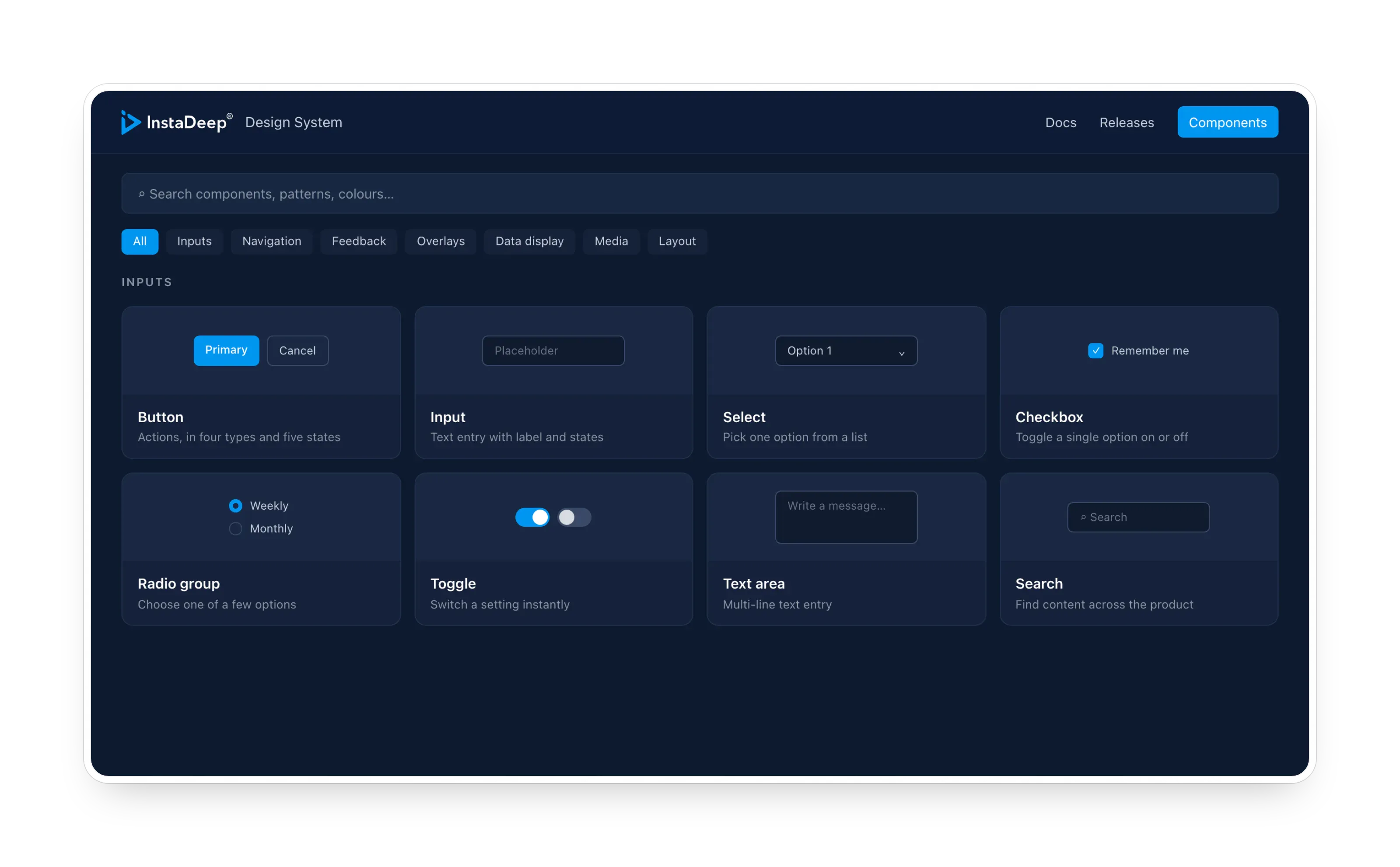
Prism is this portfolio’s name for the Deep Design System.
- Problem: A fast-growing enterprise AI company needed several product teams to collaborate efficiently and iterate quickly without their products drifting apart.
- Bet: Build the Deep Design System for designers and engineers alike, from accessible primitives up, with the same structure in Figma and in code.
- Result: The Deep Design System, shared across four product teams: a harmonised experience across products, and less time to ship and iterate on new features.
The problem worth solving
As the company grew from a startup into an enterprise with multiple products, so did the cost of building UI from scratch: slower ideation, inconsistent experiences across products, and too much time spent on UI iteration between design and engineering.
The project had three goals, one per audience:
- Business: streamline ideation and development, and improve collaboration.
- Users (UX): consistent experiences through familiar patterns and accessibility.
- Developers (DX): minimise UI iteration time while keeping quality high.
How do you let a growing team move faster without the products drifting apart?
My role
I planned and designed the Deep Design System and coordinated with engineers to keep it aligned with strategic objectives, working with four UI designers and four front-end engineers, alongside the COO and the design and engineering managers. Today I govern it as it serves four product teams.
The strategy
The Deep Design System was built iteratively, from primitives up to complex components, with research, design and testing at every stage. Two principles shaped it:
- Accessible at the foundation: if the primitives are accessible, everything built on them starts accessible.
- One structure, two tools: components are organised the same way in Figma and in code, so designers and engineers speak the same language.
Key decisions
1. Accessibility built into the primitives
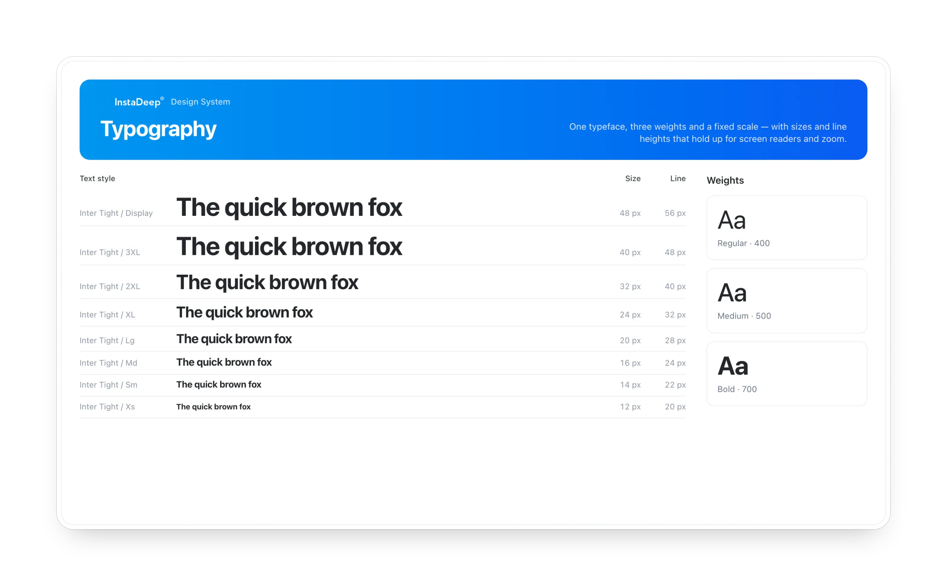
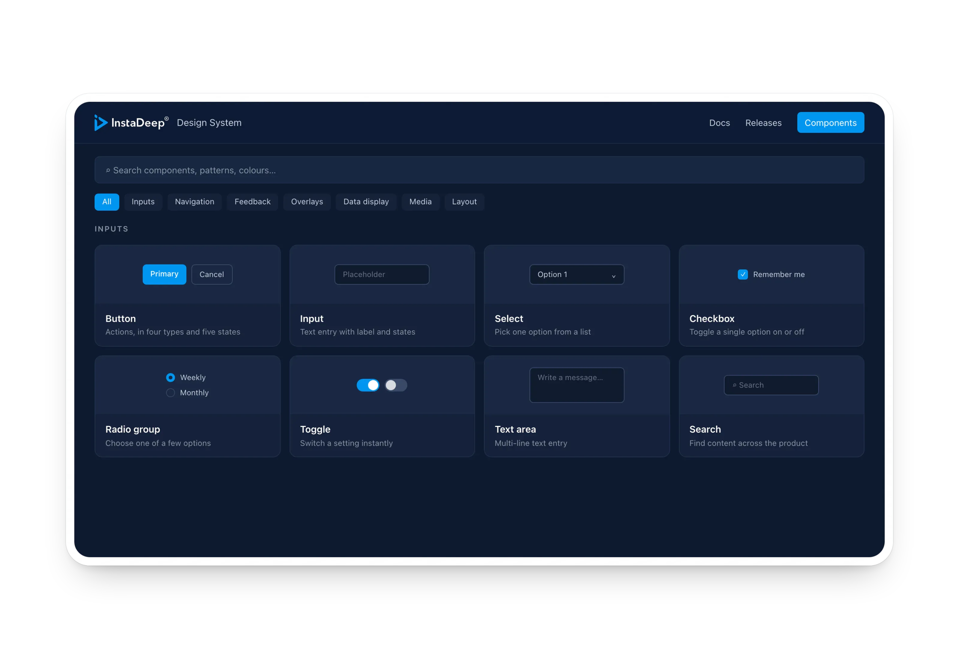
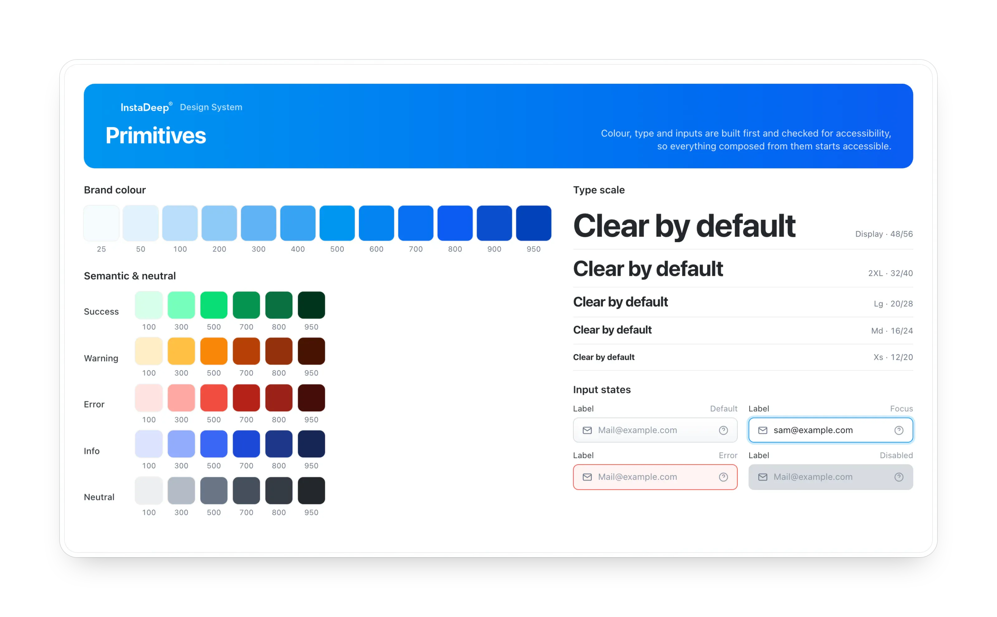
Colours, typography, iconography and inputs came first, and each was checked for accessibility: colour contrast evaluated, typography structured for correct HTML and screen readers, and inputs built with engineers to work with screen readers and keyboard navigation.
Why: fixing accessibility at the primitive level is far cheaper than retrofitting it across every product.
2. A base component, then variants
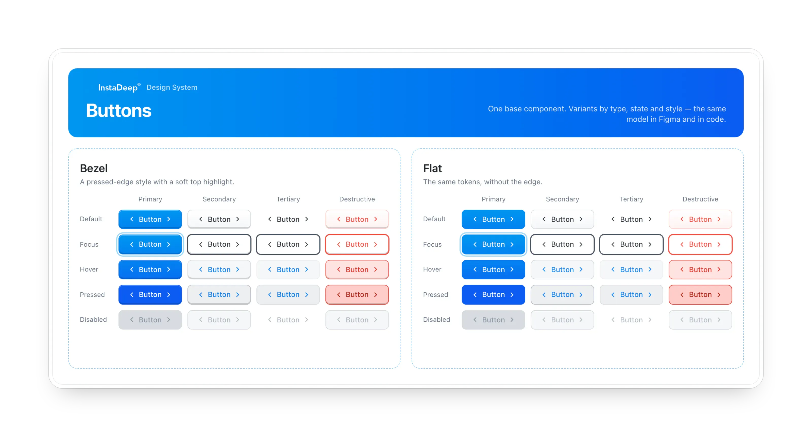
Following engineers’ feedback, every complex component starts from a base variant, and other variants are added on top. A card starts as image, title and description, then becomes a blog card, profile card or social card by swapping content.
Why: in Figma, designers drag, drop and switch states in seconds; in code, engineers implement one default component with options to switch variants. Same mental model on both sides.
3. Composition with nested components and auto-layout
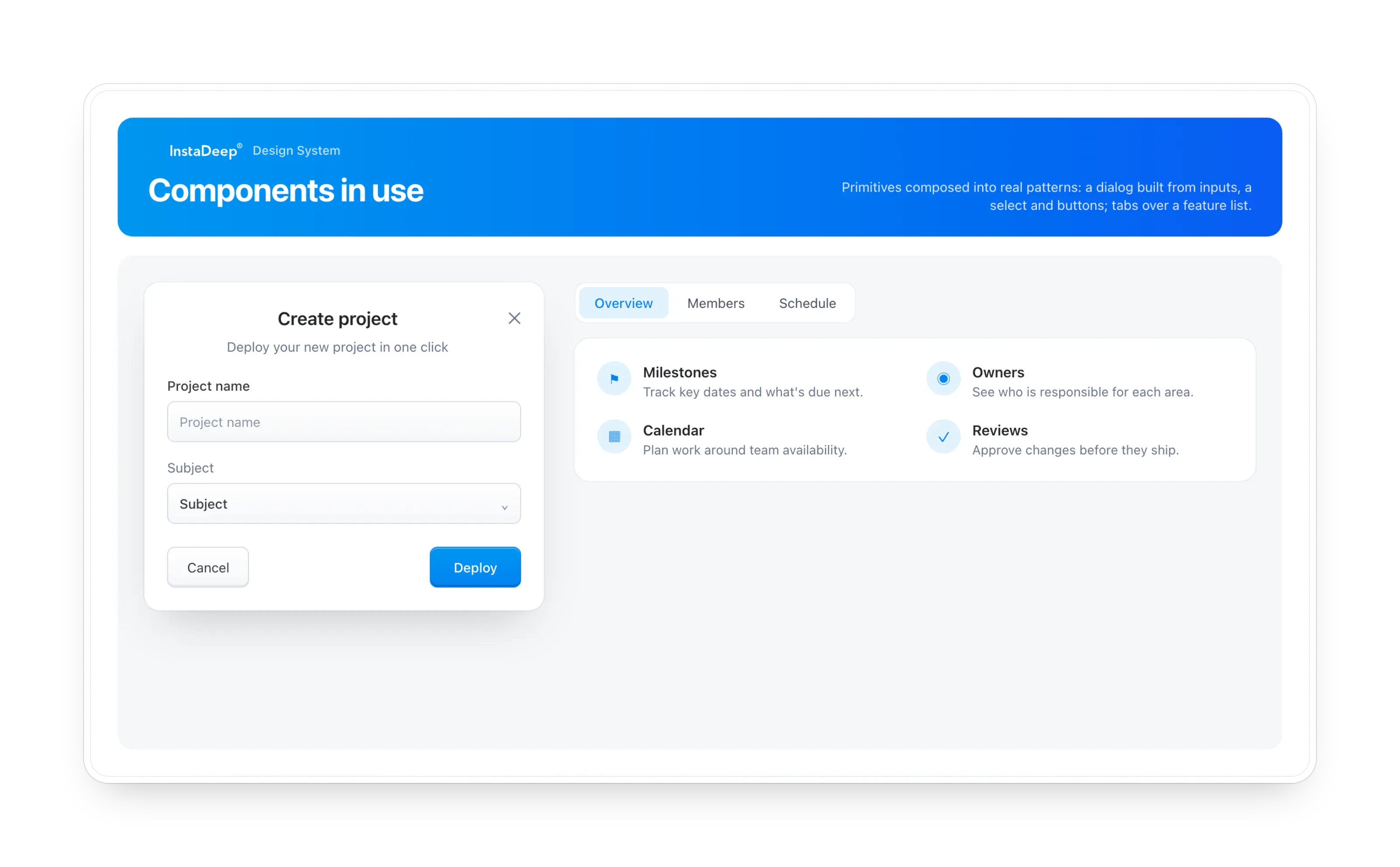
Complex elements combine primitives using nested components and auto-layout, so they stay customisable without being detached.
Why: a component that has to be detached to be useful stops being part of the system.
4. Tested in a real flow, with real users
With engineers, I built a simple app flow from the system and tested it with users. Each component’s acceptance criteria covered accessibility checks, usability testing, and the workflow for both designers and developers.
Why: a design system succeeds only if it works for its three audiences at once: users, designers and engineers.
The hard trade-off
Flexibility vs. consistency. Every new option makes a component more useful in one place and the system less predictable everywhere. The base-plus-variants model resolved it: variation lives in defined variants rather than one-off overrides, so teams get flexibility without fragmenting the experience.
Impact
- Harmonised UX across the company’s multiple products.
- Faster delivery: less time to ship and iterate on new functionality.
- Shared language between design and engineering, from Figma to code.
- The Deep Design System is adopted across four product teams, with ongoing governance as the products grow.
What I learned
A design system is a significant time investment and hard to test well, but it pays back quickly. The biggest lesson: design it with engineers from day one. Their feedback on base components and variants shaped the system more than any visual decision.
More screens